Chapter 2 Principal components analysis
2.1 Introduction
The central aim of principal component analysis (PCA) is reducing the size of a multivariate data set while still accounting for as much of the original variation as possible. In doing so it transforms a set of intercorrelated variables \(x_1,\ldots,x_p\) into a set of uncorrelated variables \(y_1,\ldots, y_p\), the so-called principal components. The idea is that if a few principal components are able to account for the main sources of variation in the original variables, without a commensurate loss of information, this will facilitate the analysis of the data set.
For example, car magazines, videogame magazines, and the like often compare a range of products on several criteria (variables) but additionally provide a single, overall, summary score. This summary score is meant to provide, loosely speaking, a weighted average of the scores on all the individual criteria.
With PCA we attempt something similar. We try to generate summary scores for the observations based on the values of all the individual variables. However, we often generate several summary scores from one set of variables and we allow more flexibility than just weighted averages. The summary variables in standard PCA are linear combinations of the original variables.
For example, suppose we wish to use the average of two responses, \(x\) and \(y\). Clearly, we would use the linear combination
\[\frac{x+y}{2}\]
This can be written as \(0.5x+0.5y\). Another linear combination useful to compare \(x\) and \(y\) would be \(x-y\), which can be also written \(+1x-1y\). When \(x\) is large, positive and \(y\) is large, negative, \(x-y\) will be large, positive, the linear combination will have a large, positive value (a large, positive score in PCA). On the other hand when \(x\) is large negative and \(y\) is large positive, \(x-y\) will have a large, negative score. When \(x\) and \(y\) are approximately equal \(x-y\) will have a score close to zero.
Suppose we wish to compare \(x\) with the average of other two variables \(y\) and \(z\). We could use
\[x-\frac{y+z}{2}\]
Again, we have a linear combination of the variables \(x\), \(y\) and \(z\) and we can write this combination as \(1x-0.5y-0.5z\). The coefficients 1, \(-0.5\) and \(-0.5\) are called the loadings in PCA. They indicate how much each variable contributes to the score and the manner (positive, negative) in which they contribute.
As another example, suppose we wish to compare the average of our first four variables \(x_1\), \(x_2\), \(x_3\) and \(x_4\) with the remaining ten variables \(x_5,\ldots,x_{14}\). A linear combination to achieve this can be
\[0.25(x_1 + x_2 + x_3 + x_4)-0.1(x_5 + x_6 + \dots + x_{14})\] The 14 loadings take the values \(+0.25\) or \(-0.1\). When the \(x_1, \ldots, x_4\) are relatively large and the \(x_5,\ldots,x_{14}\) are relatively small, the score for this linear combination will be large, positive. When the \(x_1, \ldots, x_4\) are relatively small and the \(x_5,\ldots,x_{14}\) are relatively large, the score will be large, negative.
Hence, the objective of PCA is to produce optimal linear combinations (involving loadings and scores) which maximise the representation of the variation in the original data set using a few new summary variables. The principal components generate a simplified view useful for interpretation and plotting purposes:
Sometimes they are useful to define a (smaller) set of new variables summarising the original ones. For example, to build a economic, environmental or ecological index; or to be able to manage and visualise hundreds or even thousands of variables as it is commonly the case with high-throughput data in the omics sciences.
Other times they are just used as a technical device to reduce a high-dimensional data set where \(p\) is typically greater than \(n\), e.g. to be able to conduct regression analysis with many explanatory and/or high correlated explanatory variables.
Some examples of real-world applications include:
- Building synthetic indicators (health, meteorological, environmental, economic indexes).
- Image analysis: identification of similar faces, phenotypes, image compression, \(\ldots\).
- Sensory analysis: visualise relationships among wine varieties and sensory attributes.
- Ecology: visualise relationships among several environmental variables and species.
2.2 Basic elements
Given a set of \(p\) variables \(x_{1}, x_{2}, \ldots, x_{p}\) with covariance matrix \(\Sigma\), each principal component (PC) \(y_{i}\) is a linear combination of the original variables:
\[y_{i}=l_{i1}x_{1}+\ldots+l_{ip}x_{p} \quad i=1,\ldots,p,\] where the loadings \(l_{i1},\ldots,l_{ip}\) are computed in a way such that the variance of each PC \(y_i\), \(Var(y_{i})\), is maximised and the PCs are uncorrelated with each other. As we can always find a linear combination giving rise to an infinite variance, a technical condition is imposed to determine a solution. In particular, the loadings are constrained so that \(\sum_{k=1}^p l^2_{ik}=1\) for each PC \(y_i\).
By construction, the PCs satisfy the following key properties:
\(\sum_{i=1}^{p}Var(y_{i})=\sum_{i=1}^{p}Var(x_{i})\), hence the total variability of the PCs always equals the total original variability.
\(Var(y_{1})\geq Var(y_{2})\geq\ldots\geq Var(y_{p})\), hence the first PC explains most of the total variability, its variance \(Var(y_{1})\) has the maximum value. The variance of the second, \(Var(y_{2})\), is the maximum possible variance among all PCs after that of \(y_1\). The variance of the third, \(Var(y_{3})\), is the maximum after those of \(y_1\) and \(y_2\), and so on.
The covariance \(Cov(y_{i},y_{j})=0\) for any pair of PCs \(y_i\) and \(y_j\).
Hence, every linear combination will maximise its respective variance, but they will be relative maxima to respect to each other so, under certain conditions, we will be able to arrange them in decreasing order. For a PC \(y_i\), the ratio
\[\frac{Var(y_{i})}{\sum_{k=1}^{p}Var(y_{k})}\]
measures what fraction of the original variability is explained by the \(i\)th PC. If we consider the subset of the first \(q\) PCs (after ordering them according to the size of their variances),
\[\frac{Var(y_{1})+\cdots +Var(y_{q})}{\sum_{k=1}^{p}Var(y_{k})}\] this calculation informs about how much of the original variability is explained by the first \(q\) PCs. In many cases, a few PCs will account for most of the original variability. And so, the dimension of the multivariate data set can be reduced without losing too much information.
The loadings are useful to interpret the PCs. Their value is proportional to the correlation between the PCs and the original variables (as long as the original variances are similar). Once the loadings are obtained, the result of replacing the original values \(x_{1}, x_{2}, \ldots, x_{p}\) in the PC equations provides the numerical values of the PCs \(y_1,\ldots, y_p\), these are the scores.
2.3 PCA on standardised variables
PCA is not invariant to the scale of the variables. Often, when the original variables are all measured on unrelated scales, it makes sense to work with standardised variables. This us usually handled in practice by transforming the variables to have zero mean and unit variance. That is, instead of working with the variables \(x_i\), we use
\[z_i=\frac{x_i-\overline{x}_i}{s_i}\] The standardised variables \(z_i\) (a.k.a. \(z\)-scores) have all mean equal to 0 and variance/standard deviation equal to 1. Note that doing PCA on the \(z's\) is equivalent to derive the PCs from the correlation matrix of the data set, instead of from the covariance matrix.
Without this adjustment the original variables with relatively large variances will have the largest loadings and will excessively influence the results, tending to dominate the first PCs and masking the relative contributions of the others. This is e.g. the case when mixing variables taking values in the thousands, like say annual earnings, with variables accounting for body weight in kilograms. In order to give all the variables the same relevance in the solution it is necessary to standardise.
However, note that the PCAs conducted on the original scale of the variables \(x_i\) and the standardised scale of the \(z_i\) will generally lead to different results with no simple correspondence between them. Thus, to work with original or standardised variables must be a thoughtful decision in the context of the application and accounting for the characteristics of the variables. Note that some software packages and researchers standardise the variables by default. However we recommend that this must be assessed on a case by case basis. For example, when working with spectral data typically consisting of many variables, standardising will have the (generally undesirable) effect of giving the noise signals the same relevance as the signals presenting genuine biological processes.
Finally note that when PCA is based on the correlation matrix (standardised variables), then the loadings do are exactly proportional to the correlation between the PCs and the original variables.
2.4 PCA of the air pollution data set
The data were collected as part of an air pollution study across cities in the USA (Everitt & Hothorn, 2011). The following variables were obtained for 41 US towns. An objective of the study was to investigate how the pollution level (\(\textrm{SO}_2\)) was explained by the six other environmental variables, which sounds like a regression-type analysis. We will focus here on using PCA to explore the relationships between those six environmental variables and characterise the towns according to them. The R file with the data set is called air_pollution.Rdata.
2.4.1 Basic R functions involved
princomp: performs PCA on the covariance or correlation matrix using a a mathematical method called spectral decomposition. Check ?princomp for details and options.
prcomp: performs PCA on the data matrix using a method called singular value decomposition. Check ?prcomp for details and options. In general, this is regarded as more numerically accurate than PCA based on the spectral decomposition (princomp). This might be relevant for some large scale applications, but no different will be generally found in standard applications.
biplot: works on two sets of two-dimensional points providing the coordinates for the biplot representation. Alternatively, it can take princomp and prcomp class objects as input.
We begin by deriving the PCs of the air pollution data, excluding SO2 (this one is considered in this setting a variable which is more a response to the environmental conditions represented by the others). Because the variables are on fairly heterogeneous and unrelated scales we standardise them; that is, we will do PCA based on their correlation matrix (check out ?princomp for details).
# Load the data (if not already loaded)
airpol <- read.table("air_pollution.txt", h = T, stringsAsFactors = TRUE)
# Correlation-based PCA on the environmental variables (columns 4 to 9)
airpol.pca <- princomp(airpol[, 4:9], scores = T, cor = T)
options(digits = 3) # Control number of digits in results
summary(airpol.pca)
Importance of components:
Comp.1 Comp.2 Comp.3 Comp.4 Comp.5 Comp.6
Standard deviation 1.482 1.225 1.181 0.872 0.3385 0.18560
Proportion of Variance 0.366 0.250 0.232 0.127 0.0191 0.00574
Cumulative Proportion 0.366 0.616 0.848 0.975 0.9943 1.00000The first component accounts for 36.6% of all the variation among the 6 variables. The first 3 PCs account for 85% of all the variation. It might be sufficient to proceed with only these 3 new variables rather than all 6 of the original variables. Using the first 2 PCs is in practice convenient for graphical representations. This information can be indirectly displayed by a scree plot.
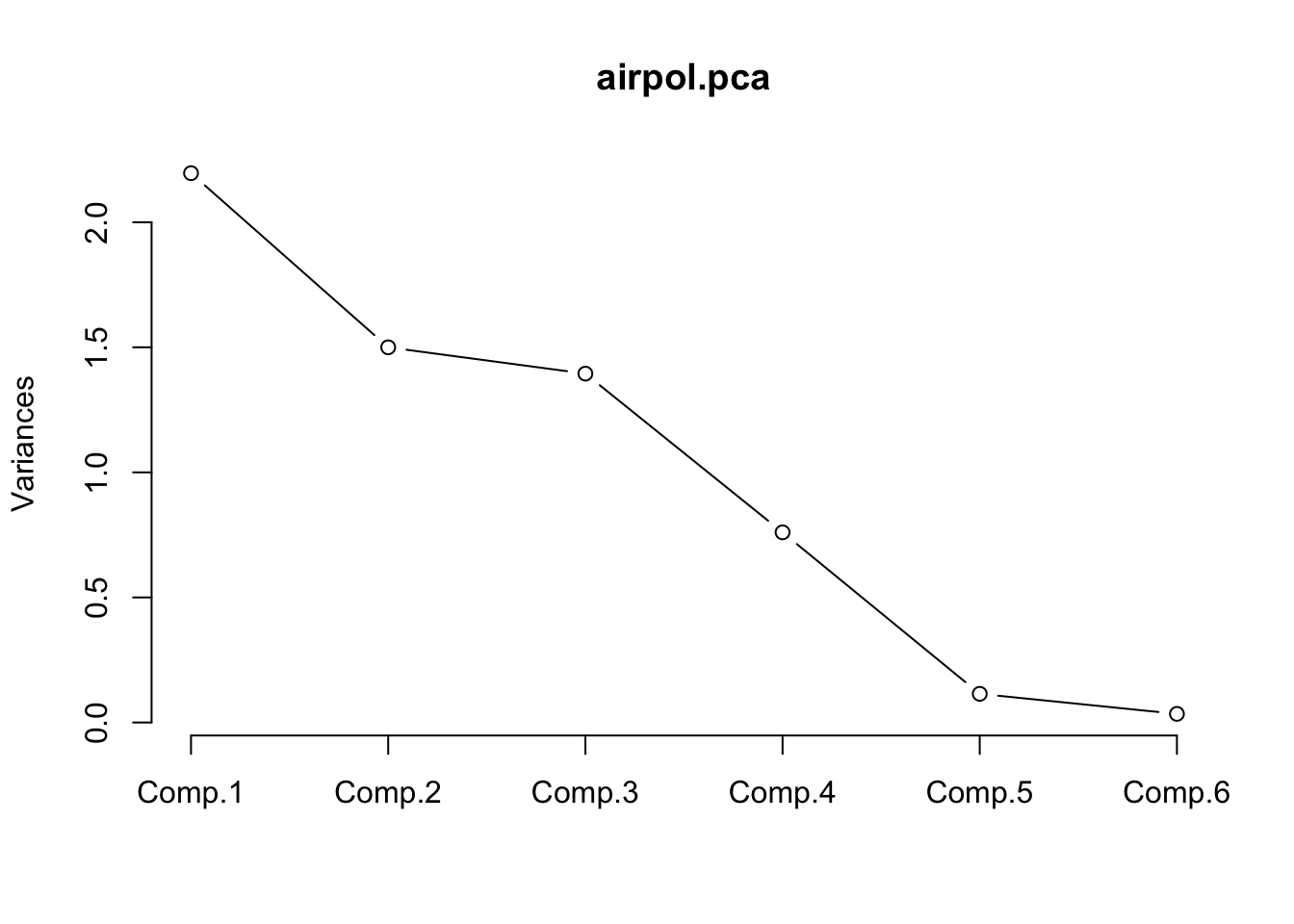
This graph shows the variance explained by each PC. An “elbow” shape indicates from where considering more PCs does not imply a large gain in explained variance. Of course if all PCs as used then 100% of the original variability is explained, but no reduction in dimension is attained. Hence, this is the practical trade-off between aiming to explain as much as possible without using too many PCs. Typically explained variability above ~75% is considered good, but this depends on the context of application (e.g. with high-throughput data including several tens or hundreds of variables the first PCs often explain relatively low fractions). However, it is not uncommon that a few PCs accounting for a relatively low fraction of variability represent well the main sources of variation in the data set. In our case study, using 2-3 PCs as discussed before seems to be a sensible choice.
It can be convenient to extract the scores (these are the \(y\) values above) for each observation and the PCA loadings (the \(l\) coefficients above) to self-contained objects to be used later.
scores <- airpol.pca$scores
# Label rows with town names for easy reference
row.names(scores) <- airpol$Tn
# Show scores in first 3 PCs for the first 10 towns
scores[1:10, 1:3]
Comp.1 Comp.2 Comp.3
Px 2.4401 4.1911 0.942
LR 1.6116 -0.3425 0.840
SF 0.5021 2.2553 -0.227
Dn 0.2074 1.9632 -1.266
Ha 0.2191 -0.9763 -0.595
Wt 0.9961 -0.5007 -0.433
Wa 0.0229 0.0546 0.354
Ja 1.2278 -0.8491 1.876
Mi 1.5332 -1.4047 2.607
At 0.5990 -0.5872 0.995 Comp.1 Comp.2 Comp.3
Temp 0.3296 0.128 0.6717
Manuf -0.6115 0.168 0.2729
Pop -0.5778 0.222 0.3504
Wind -0.3538 -0.131 -0.2973
Precip 0.0408 -0.623 0.5046
Days -0.2379 -0.708 -0.09312.4.2 Interpreting the PC loadings
The following points summarise general guidelines for interpreting the loadings:
- When all loadings are very similar in size and sign, then the PC is kind of an average of all variables. It is e.g. the case of a PC representing an overall economic or ecological index summarising the information across several variables.
- When loadings are very similar but some positive, some negative, then the PC represent a contrast, a comparison between variables in the data set.
- If some loadings are approximately zero, then the corresponding variables are not associated with the PC.
- Sometimes interpretation is not easy or possible, particularly for later components.
For the air pollution data, PC1 is a comparison between Temp and {Manuf, Pop, Wind, Days}. Towns with above average temperature and below average for all of {Manuf, Pop, Wind, Days} will have a large positive score. Towns with below average temperature and above average for all of {Manuf, Pop, Wind, Days} will have a large negative score. We interpret PC1 as ‘environment’ or ’quality of life’. Towns with large positive scores are warm, dry, calm, low population and without too many manufacturing businesses. Towns with a large negative score are cool, wet, windy, busy and industrial.
PC2 is dominated by rain. Towns with a large positive score are frequently very wet; towns with a large negative score are usually dry and do not experience very wet weather.
PC3 defies interpretation and that is not uncommon. Principal components are derived according to the statistical criterion of maximising variation and ignoring any underlying biological or other structure in the data.
Note that there is indeterminacy in the loadings. For any PC all the loadings can be multiplied by -1 without causing any fundamental change. The % variance remains the same. The order of the scores is simply reversed, but the differences in absolute values and interpretations of the PCs remain the same. Note also that the second table of results shown by princomp$loadings (SS loadings and so on) is actually fairly useless in practice.
2.4.3 Plotting the PC scores
The PC scores are new variables representing the observations. The can be used to display them in a scatterplot. The following figures shows this using the first two PCs of the air pollution data set. The town labels stored in the variable Tn are used to identify them.
plot(scores[, 1], scores[, 2], type = "n", xlab = "PC1", ylab = "PC2")
text(scores[,1], scores[,2], airpol$Tn)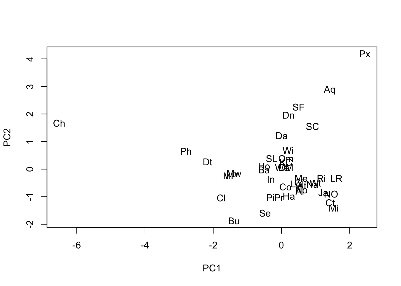
We see in this plot that Chicago (Ch) is the large, busy, slightly windy and slightly wet city and that Phoenix is a small, quiet, very calm, very dry city (Px). Be aware that because of the indeterminacy of PCA sometimes different software packages can appear to produce different solutions, or even when running PCA several times on the same system. But it is simply that the loadings have been reversed from one to another for one or several PCs. The scores will appeared reversed in the graph, but the relative positions of the points will be exactly the same.
2.4.4 Relating the PCs to SO2
We can see whether these new PC variables are linked to Sulphur Dioxide computing ordinary correlations. We use the round function to obtain the output in a more readable format.
             Comp.1 Comp.2 Comp.3
        1.00  -0.64  -0.12   0.02
Comp.1 -0.64   1.00   0.00   0.00
Comp.2 -0.12   0.00   1.00   0.00
Comp.3  0.02   0.00   0.00   1.00
Clearly PC1 has a moderate negative correlation with SO2 but none of the other PCs have. Note, in passing, the zero correlation among the PCs as expected.
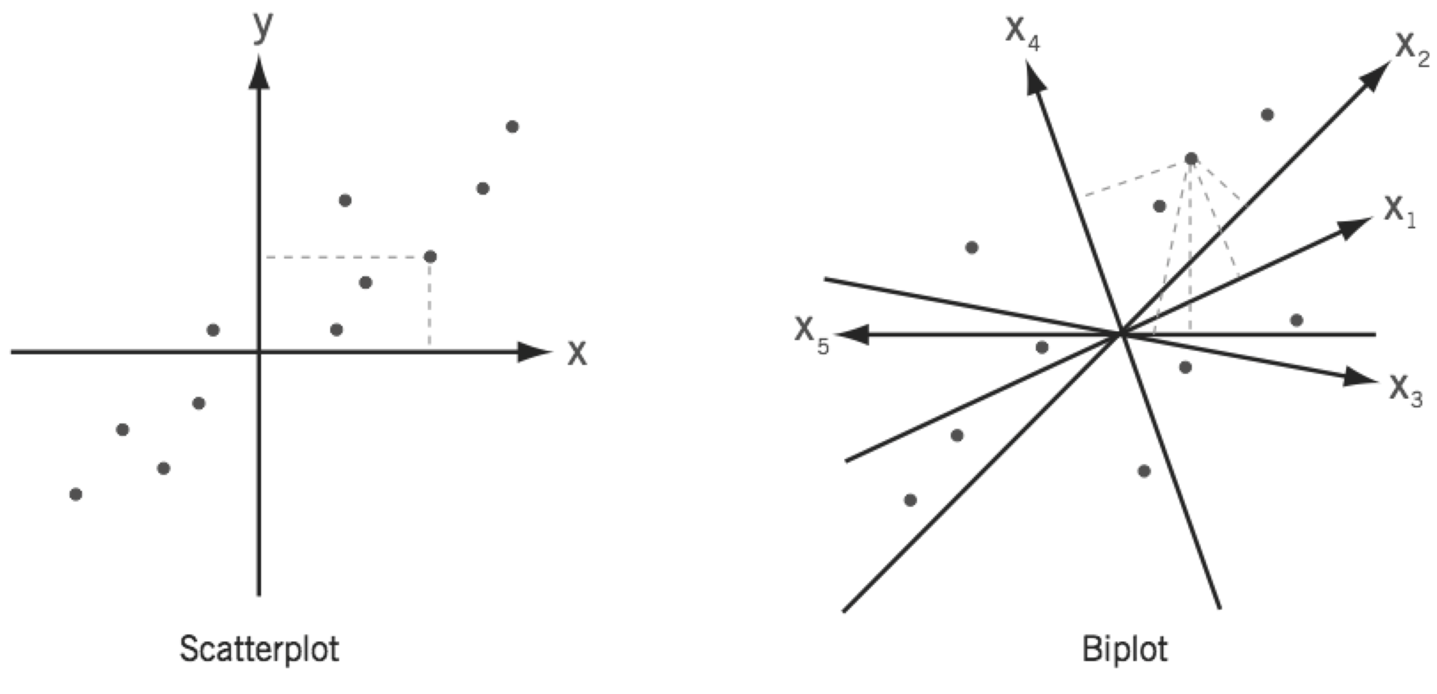
2.5 PCA biplots
A biplot can be understood as a generalisation of the scatterplot of two variables to the case of many variables. While a simple scatterplot has two perpendicular axes, biplots have as many axes as there are variables. However, in a biplot the values are represented only approximately in a space of lower dimensionality, usually 2-dimensional using the first two PCs.
Biplots provide a very useful summary of the results of a principal component analysis (note that they can be also produced from other multivariate techniques). The following code produces the PCA biplot for the air pollution data set using the first two PCs (check out ?biplot). Reference lines are useful to facilitate interpretation.
biplot(airpol.pca, xlabs = airpol$Tn, choices = c(1, 2), xlab = "PC1", ylab = "PC2")
# Add reference lines
abline(h = 0, lty = 2, col = "grey")
abline(v = 0, lty = 2, col = "grey")
In the biplot below both variables and observations are jointly displayed. The segments from the origin (commonly called rays or axis) represent the original variables and the points are the scores on the first two PCs (note that the configuration of the points is the same as in the scatterplot of the scores we produced manually above). Occasionally a biplot of components other than the first two is helpful. The value of the biplot as an approximation to the entire data set is only as good as the extent to which the first two PCs explain all the variation in the data, in this case 62%.
Main points to interpret the biplot display are the following:
The angle between rays indicates correlation between the corresponding variables.
- Rays in the same direction indicates positive correlation (rays approx. overlapping indicates correlation approx. 1).
- A 90 degrees angle between them indicates no correlation.
- Rays in opposite directions indicate negative correlation (approx. straight angle indicates correlation approx. -1).
The length of a ray approximates the standard deviation of the variable (if not standardised). If the variables are standardised to have unit variances, then the lengths indicate how well variables are represented.
The angle of the rays with the PC reference lines determined by the loadings and indicates how the variables relate with each PC.
The distance between points approximates the similarity between observations in terms of the original variables.
Observations (points, PCA scores) can be ranked on each original variable by their orthogonal projection onto the (extended) variable axis (rays). For example, extend the line for POP in both directions. Now drop a perpendicular from say, Ch, onto this extended line. The distance from where the perpendicular hits the Pop ray to the origin measures the (relative) value of Ch for Pop. Measuring the value of all other towns in the same way shows immediately the rank order of the cities with respect to Pop. It also shows which cities are above the mean value of Pop: those on the positive side of the ray/axis. And it shows those below the average: those on the negative side of the ray, the side which has to be extended backwards from the origin.
The % variance explained by selected PCs (usually the \(1^{st}\) and \(2^{nd}\) PCs) measures extent to which the biplot summarises the entire data set.
The biplot of the air pollution data set actually shows all the main features discussed before.
Some highlights of the analysis by columns (variables):
Manuf and Pop show the highest correlation, both weakly correlated with Days and Precip.
Strong negative correlation between Temp and Wind according to the angle between their rays, although they are not very well represented in the biplot (short ray lengths in a correlation biplot, check correlation matrix for actual correlation between them).
The horizontal axis (PC1) mostly accounts for a contrast between Temp and {Manuf, Pop, Wind} (the corresponding rays with origin at (0, 0) show the smallest angles in relation to this axis). This is in accordance with the analysis of PCA loadings above. This allows to discuss the relative environmental characteristics of the cities according to these two groups of variables on the basis of their values in PC1.
The vertical axis (PC2) is mostly associated to Precip and Days. Thus, cities with negative values in PC2 will be more rainy than those with positive values.
Some highlights of the analysis by rows (towns):
Chicago, a large city with a strong manufacturing base, was the potential outlier. Also, Phoenix seems to have a particular profile.
No obvious clusters of cities based on the environmental variables considered.
Some highlights of the joint analysis of rows and columns (perpendicular projection of points onto the biplot (extended) axes/rays):
Chicago distinguished by very high levels over the average in Manuf and Pop.
Wind-Temp define an axis ordering cities in relation to wind and temperature, from Chicago (the windiest) and cities like Philadelphia, Detroit, Cleveland or Buffalo on the left-hand side (temperature below average, wind over average) to cities like Albuquerque and Phoenix (the warmest) on the right-hand side (temperature over average, wind below average).
2.6 Exercises
RIME ICE data. Derive the principal components of the Rime Ice data, deciding first whether to standardise the elements (i.e. whether to use variance-covariance or correlation PCs). Do the PCs provide a good summary of all the variation among the elements? How would you interpret the first two components? Generate a biplot and make sure you can interpret it.
Air Pollution data. Does taking logs of the positively skewed variables improve the PC analysis, i.e. does it cause the % variance accounted for to increase for the first few PCs? Are the loadings of the first two PCs amenable to the same interpretation as they were before transformation?
NIR data. Which principal components are correlated with protein and which with moisture? Generate a scatter plot matrix for protein, moisture and the scores on the first 6 components. Why is a biplot not so useful with these data? Note that using
princompdoes not work here. This is because there are more variables, 68, than samples, 39. The alternative functionprcompdoes work in this case using a different technique to produce the PCA solution that does not rely explicitly on the covariance or correlation matrix. However the output ofprcompis somewhat less user friendly.
nir <- read.table("nir.txt", h=T, stringsAsFactors = TRUE)
nir.pca <- prcomp(nir[,3:70], retx=T) #return the scores in ‘x’
# Loadings for the first 5 variables (wv) in the first 6 PCs
nir.pca$rotation[1:5,1:6]
PC1 PC2 PC3 PC4 PC5 PC6
wv1 0.00863 0.02203 0.168 0.0669 -0.213 0.2062
wv2 0.01631 0.00530 0.164 0.0839 -0.170 0.1238
wv3 0.02411 0.00668 0.158 0.0812 -0.142 0.0952
wv4 0.02883 0.01934 0.159 0.0759 -0.114 0.1084
wv5 0.02802 0.02122 0.164 0.0303 -0.110 0.1162# Scores in the first 6 PCs
scores <- nir.pca$x[,1:6]
# Var. explained by the first six PCs
summary(nir.pca)$importance[,1:6] PC1 PC2 PC3 PC4 PC5 PC6
Standard deviation 0.183 0.0184 0.00863 0.00628 0.00421 0.00183
Proportion of Variance 0.986 0.0099 0.00218 0.00116 0.00052 0.00010
Cumulative Proportion 0.986 0.9959 0.99806 0.99922 0.99974 0.99984# Correlation between response variables and first 3 PCs obtained from the wv variables
cor(nir[,1:2],scores[,1:6]) PC1 PC2 PC3 PC4 PC5 PC6
protein 0.699 0.0925 -0.1891 0.6677 -0.1079 -0.00948
moisture 0.163 -0.9735 -0.0908 -0.0444 -0.0625 -0.02163